CloseKnit
Mobile Social Media App Design
MEDIUM
Mobile App
WHEN
August 2020
TEAM
Julian Killingback
MY ROLE
Design
GOALS
Design for tight-knit, interpersonal exchanges.
TOOLS
Figma
OVERVIEW
(This work is in progress.)
While YouTube and Facebook are changing to better support person-to-person contact, they remain at their core designed to network hundreds of strangers to each other and for the most part, to let them stay strangers.
We are developing CloseKnit based on an opposing principle — that social media should supplement our intimate, existing networks, which rarely exceed 200 close contacts.
BACKGROUND
CloseKnit limits the amount of friends you have.
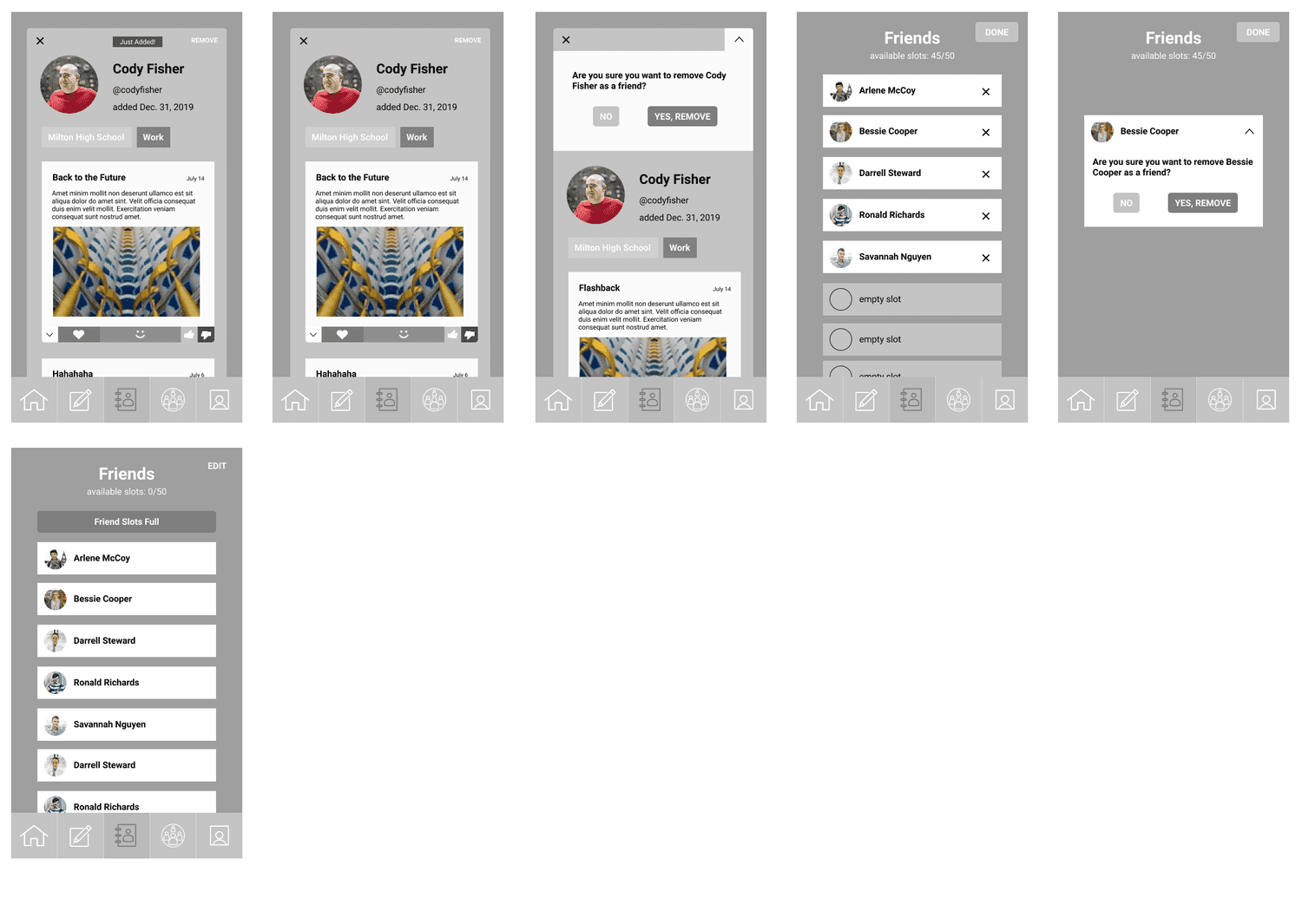
For those who might exceed the app's 50-friend limit, it asks them to evaluate their network and let go of a contact they might not keep as close.
We hope that this foundational principle helps us foster meaningful exchanges between people who know and care about each other, and helps us trim down the long lists of friends that distract us from these exchanges.
PROCESS
Before any drawing, I defined a few scenarios for the app's use with the following flow diagrams:
OnBoarding:
Adding a Friend:
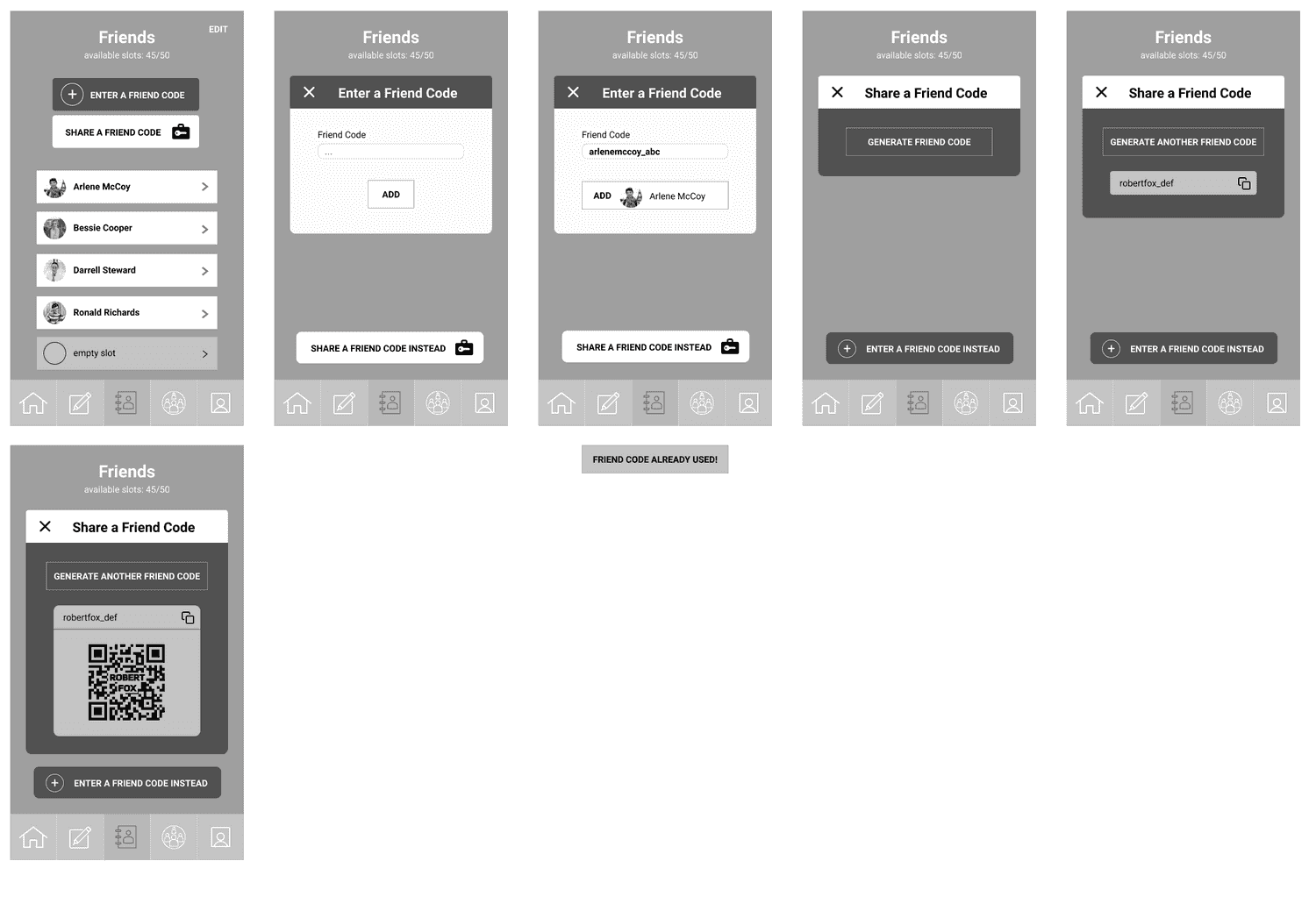
One of the key interactions in CloseKnit, a mutual confirmation process for adding friends asks users to take an extra step before expanding their social circle, and is designed to make the decision more meaningful.
Forming a Group:
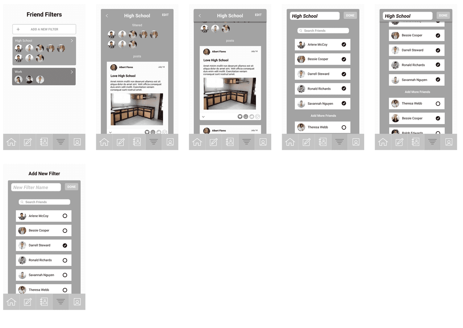
Within the app, CloseKnit's other key feature is the ability to curate the feeds of your friends, separating them by social spheres such as family, colleagues, and college friends.
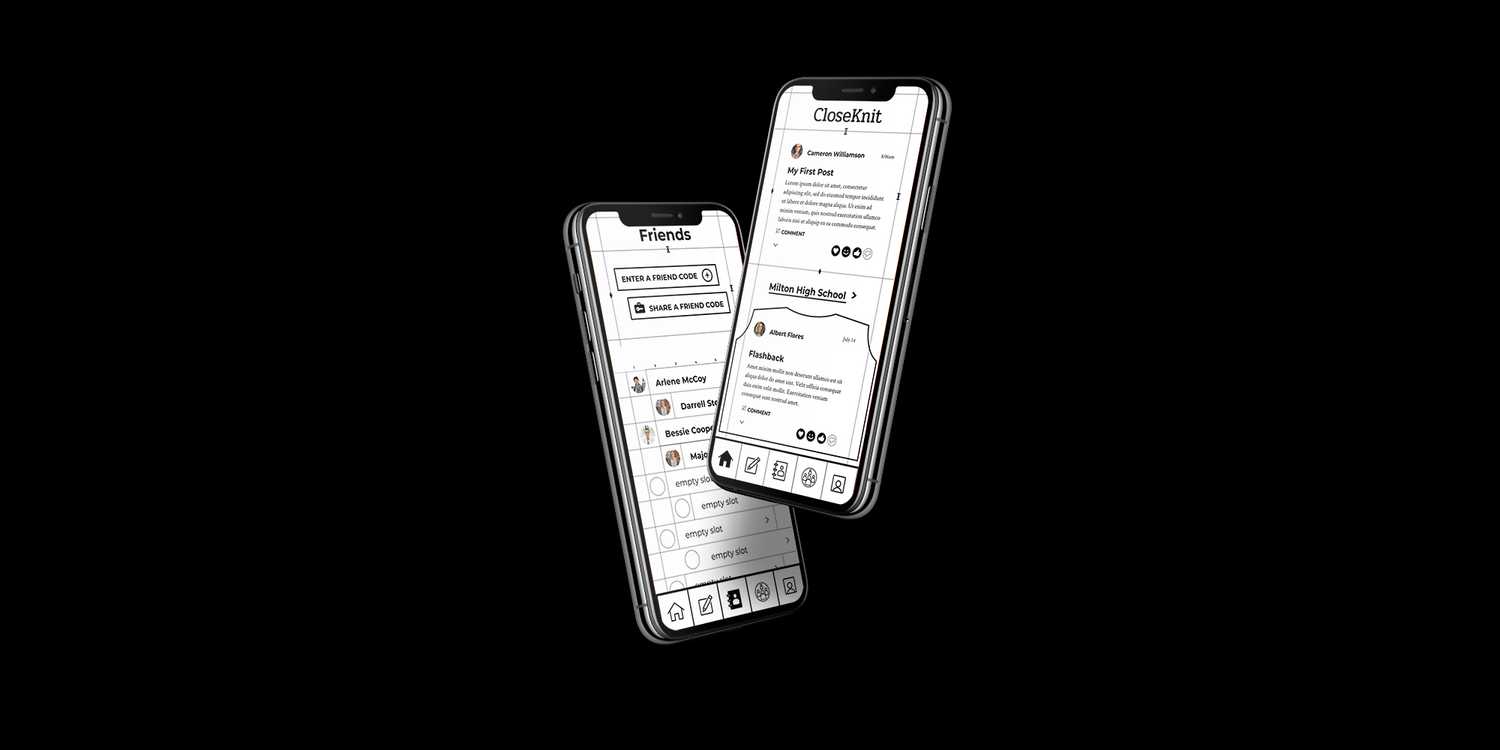
With a clear concept and tried-and-true design patterns already out there, I moved almost immediately into complete, mid-fi wireframes to map out the entire app.
OnBoarding:
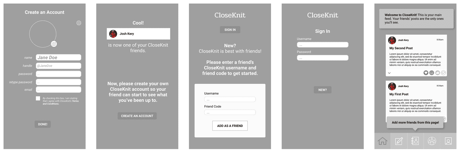
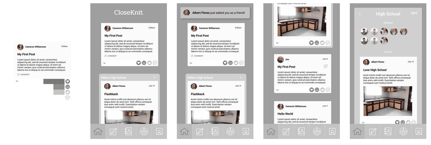
Reading Your Feed
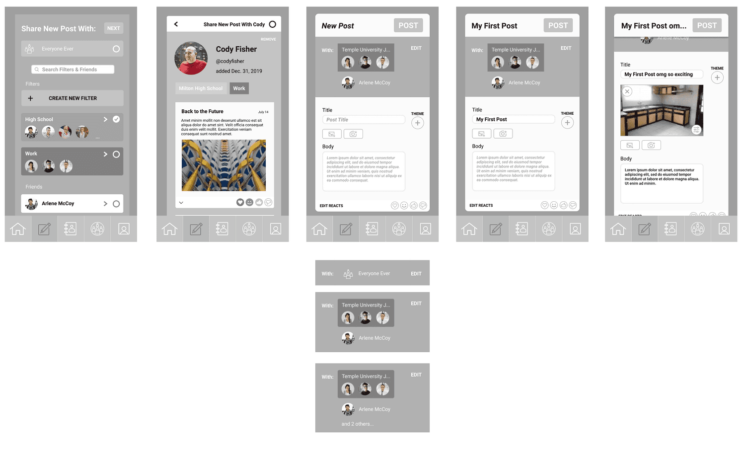
Writing a Post
Adding a Friend
Managing Friends
Curating Friend Feeds
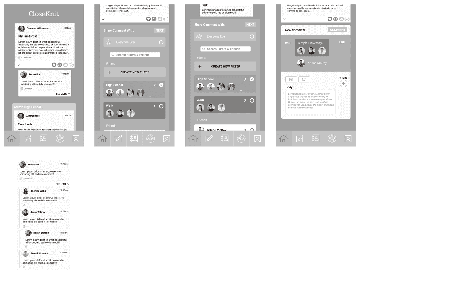
Comments
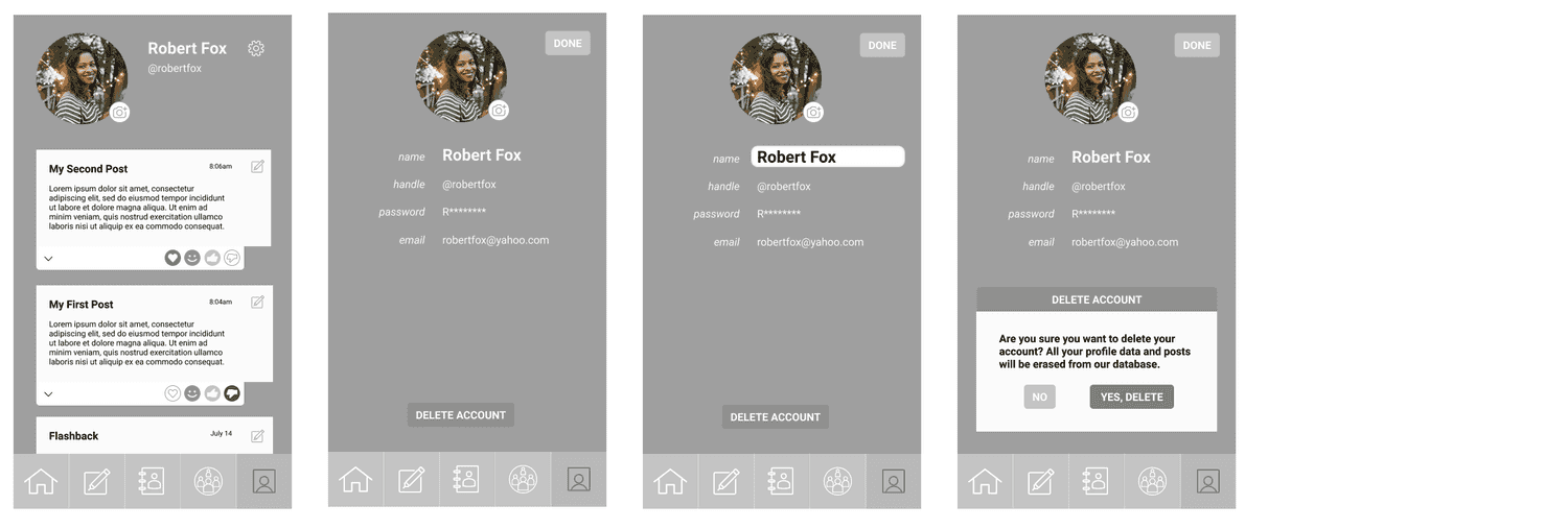
View Profile
User Testing
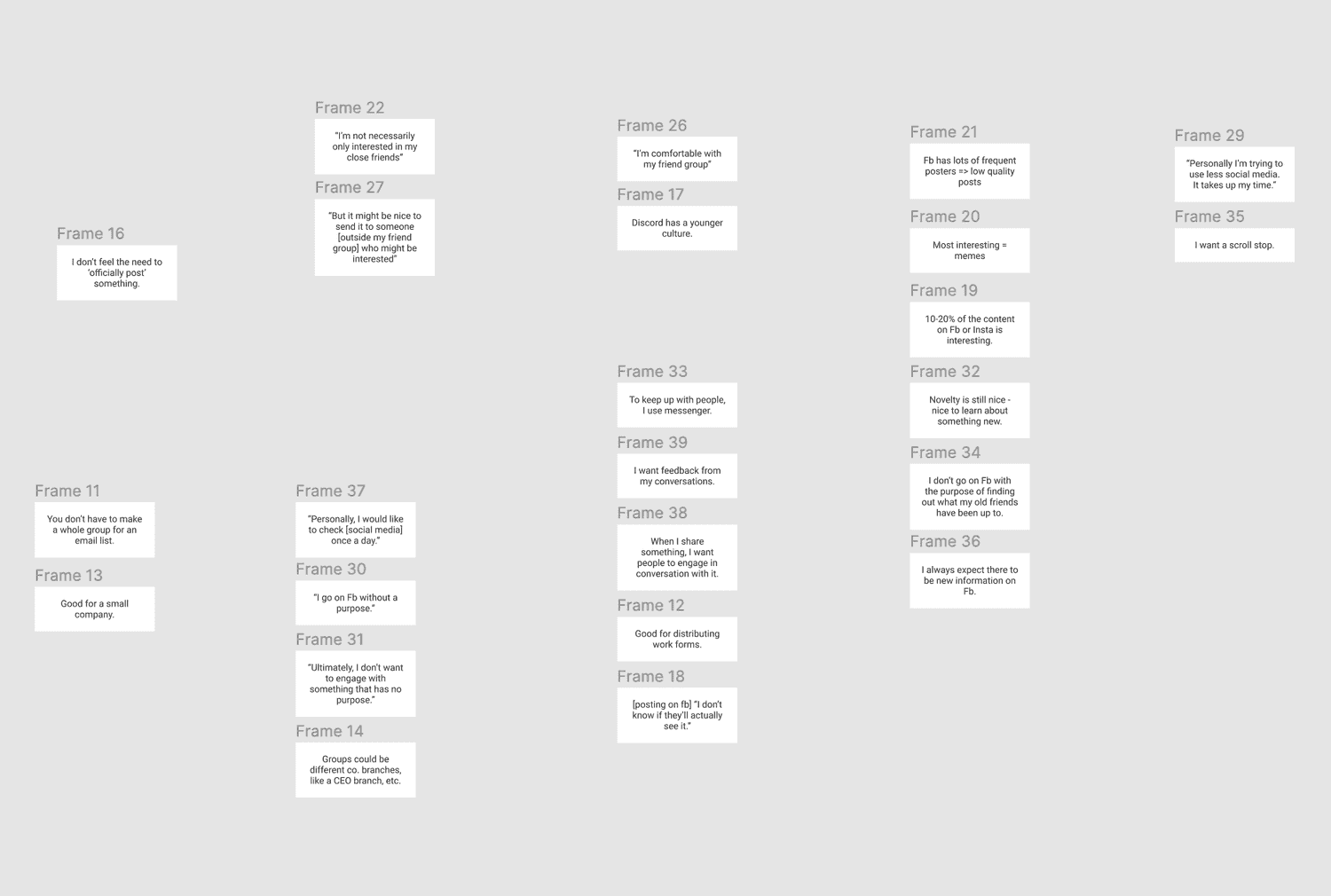
I prepared a prototype with InVision to do some brief user testing for the above wireframes.
We began to aggregate our notes into an affinity diagram (in progress):
Aesthetic Ideation
Before developing hi-fidelity mockups, I used the freedom of this personal project to explore.
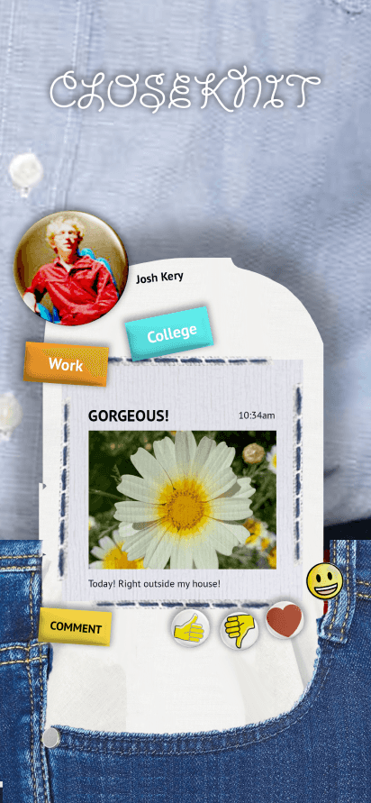
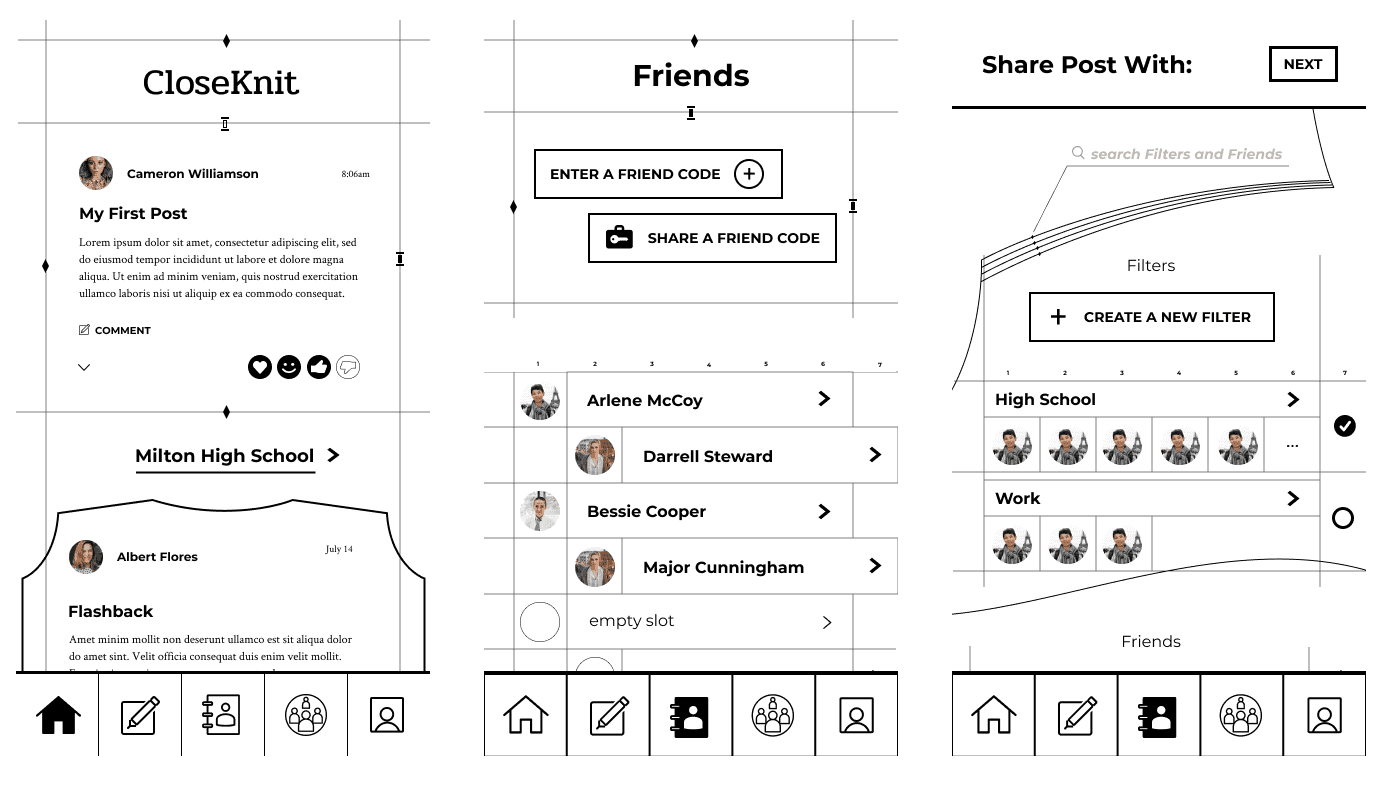
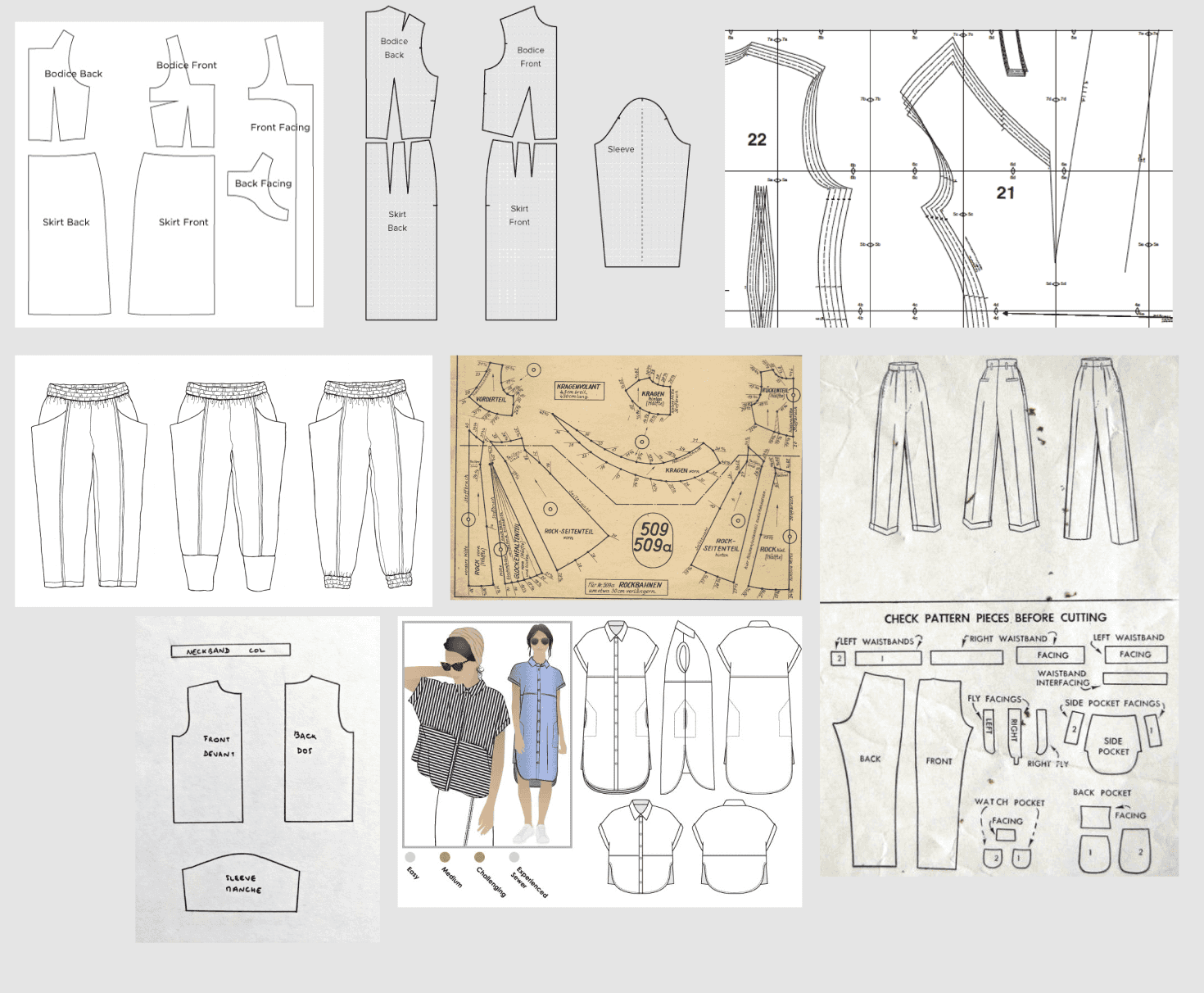
The following sketches were inspired by sewing patterns and weaving guides, in reference to the "knit" part of "CloseKnit."
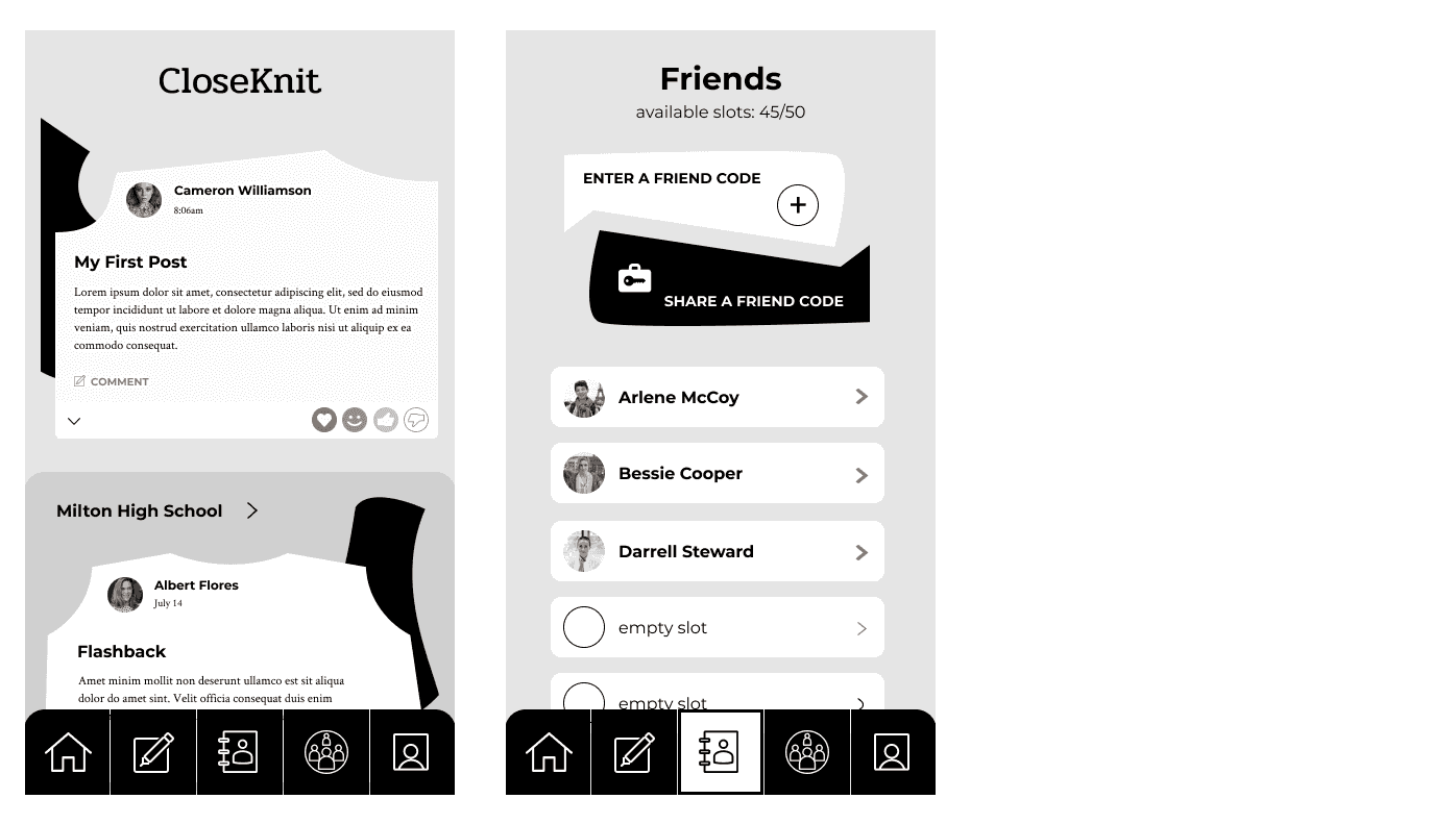
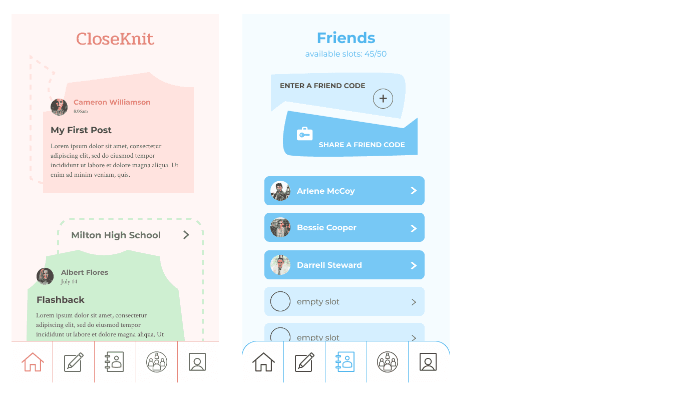
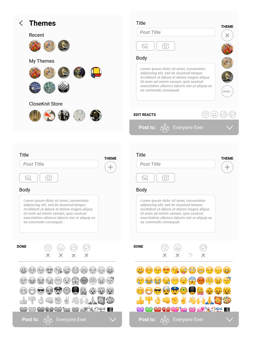
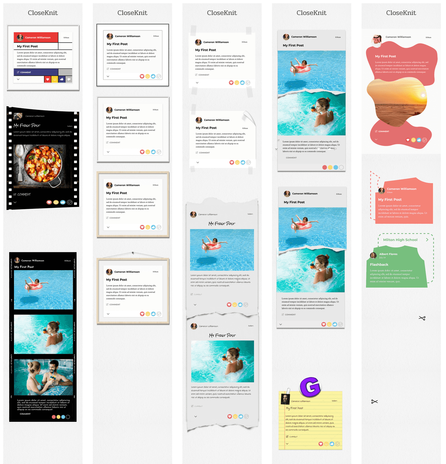
As a final exploration, we decided to devote some time to the idea of creating custom themes to stylize individual posts.
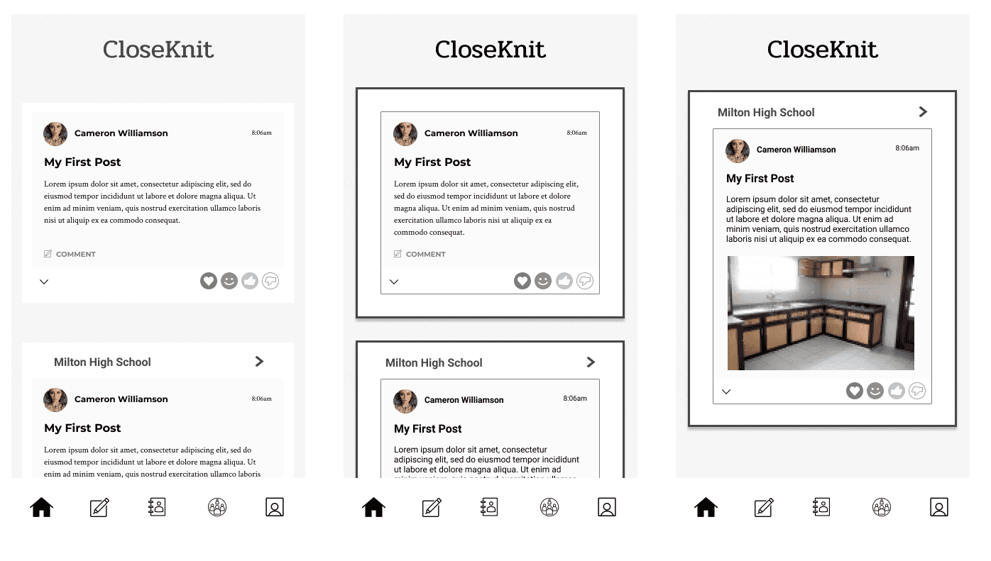
The following would be the default appearance of posts:
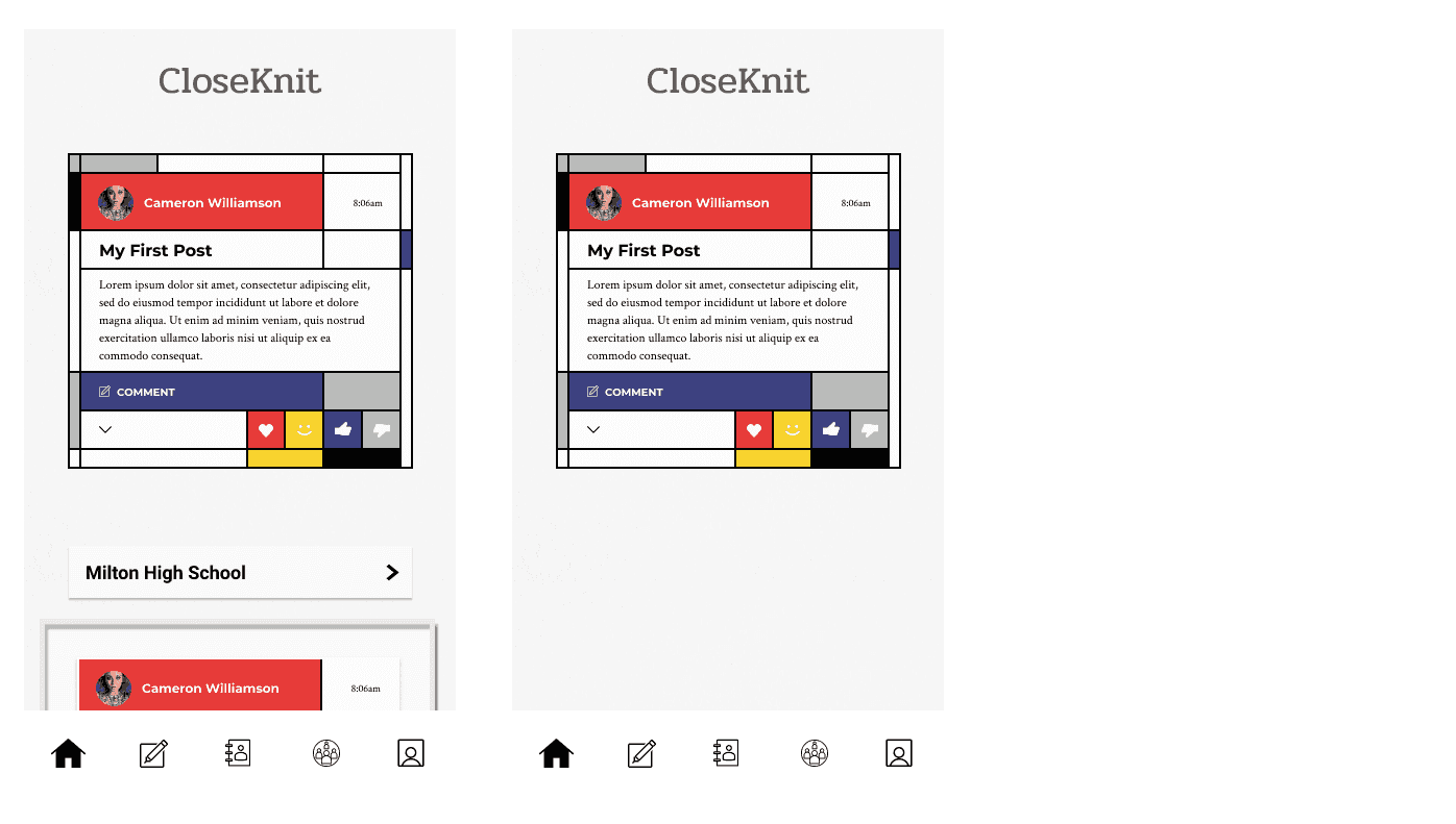
And users could might choose a style such as this:
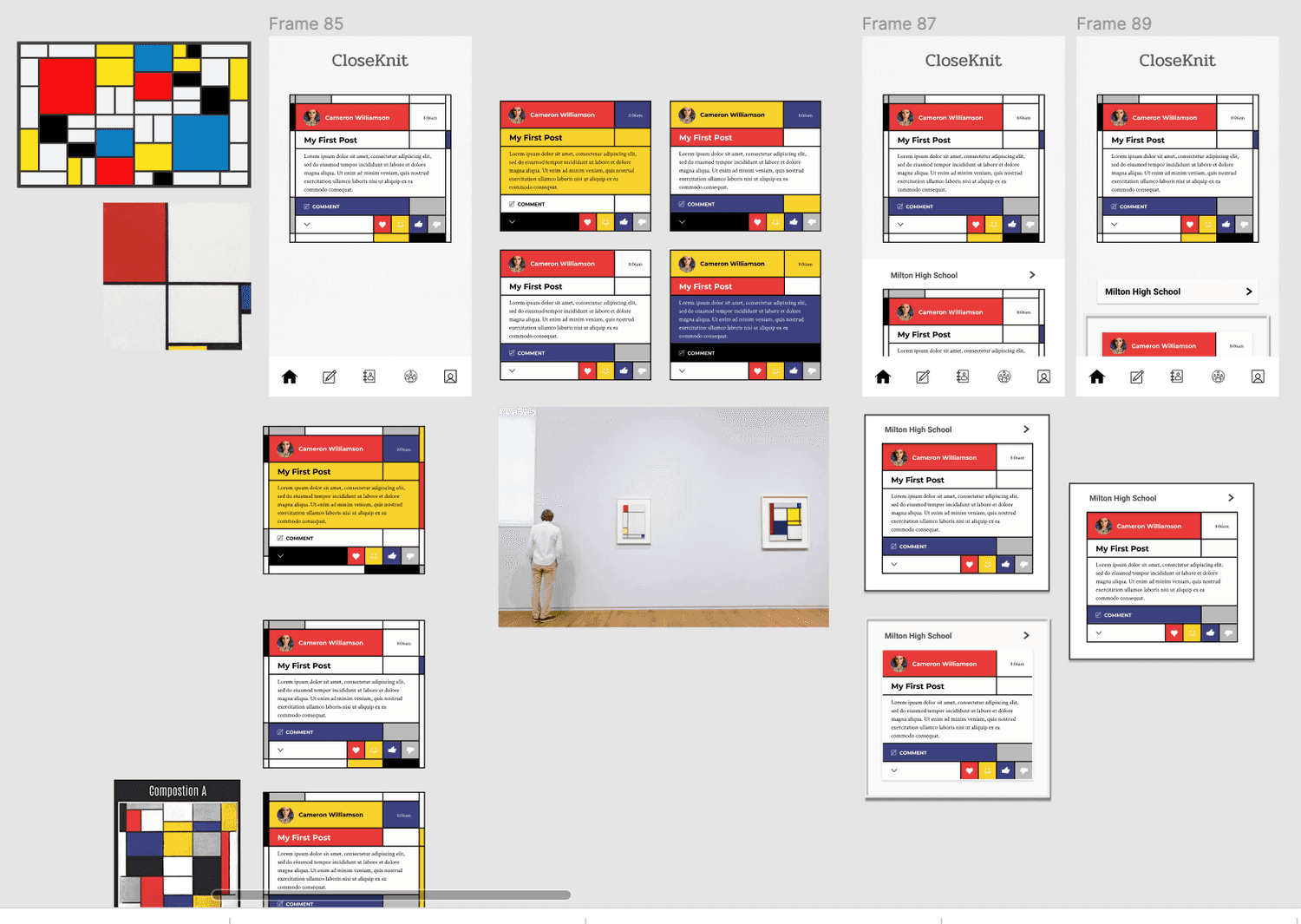
Or one of these:
