Atlantis Transit Hub
Data Driven Display Study
UX CHALLENGE
Three Transportation Methods, One Display
The San Juan Islands Atlantis Hub needs a new system of transportation displays to cope with the changing paradigm of travel in the region.
The client is interested in increasing inner-island travel in the area, across three transportation methods — planes, trains, and ferries — with a flexible travel plan: the PTF Pass.
UX SOLUTION
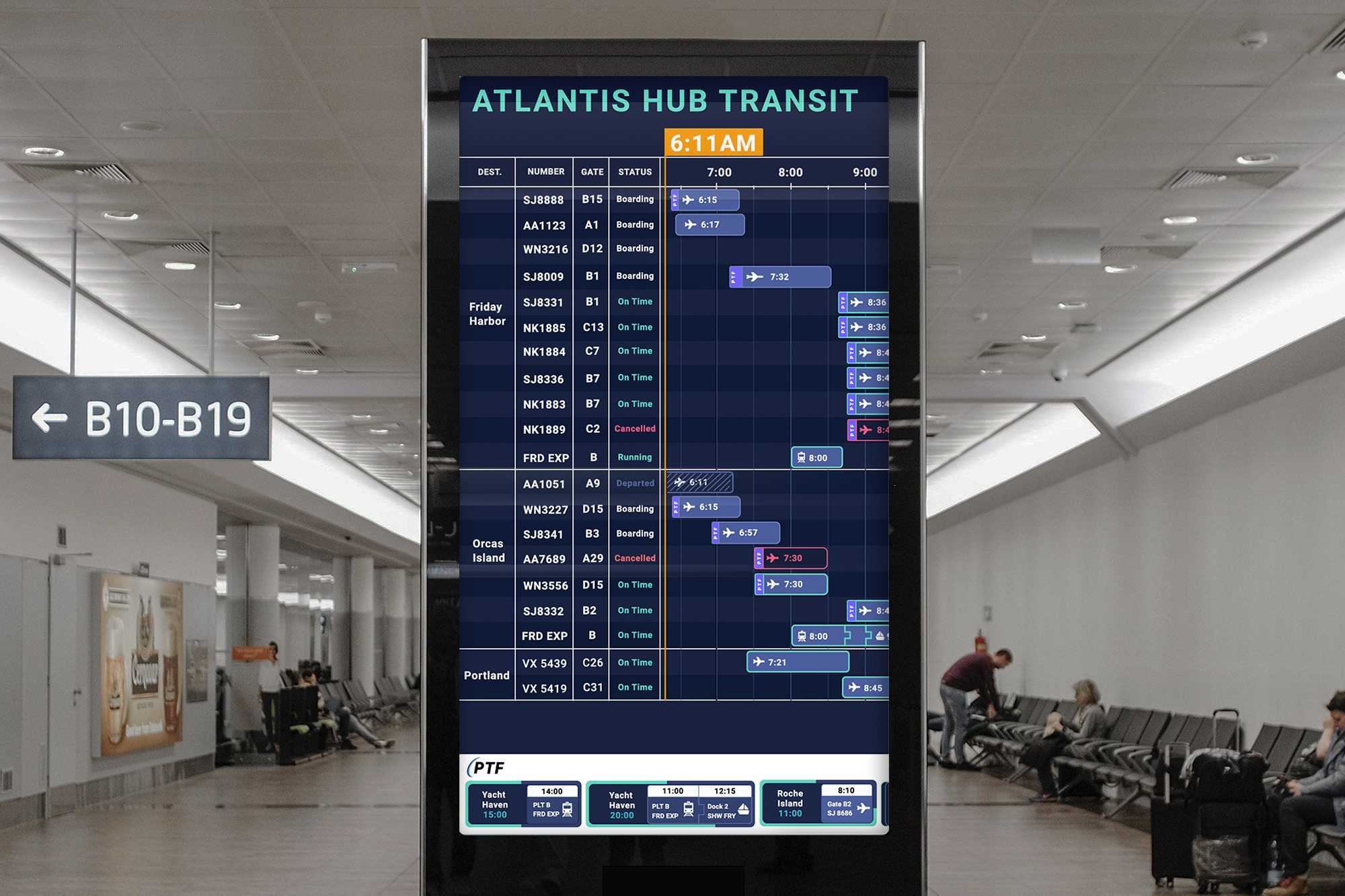
Dynamic Data-Driven Display
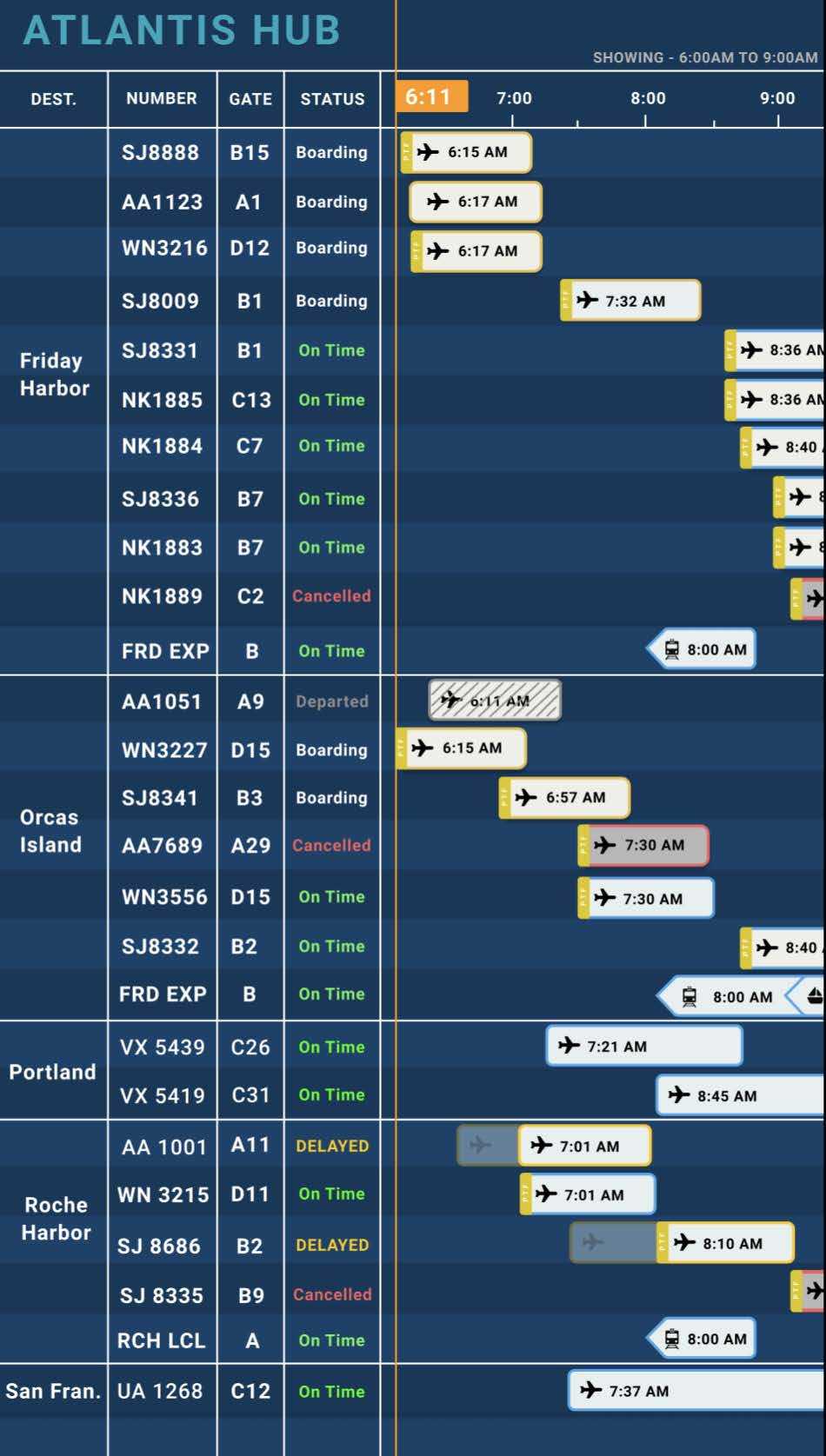
We preview all travel options through a continuously moving display on our main screen:
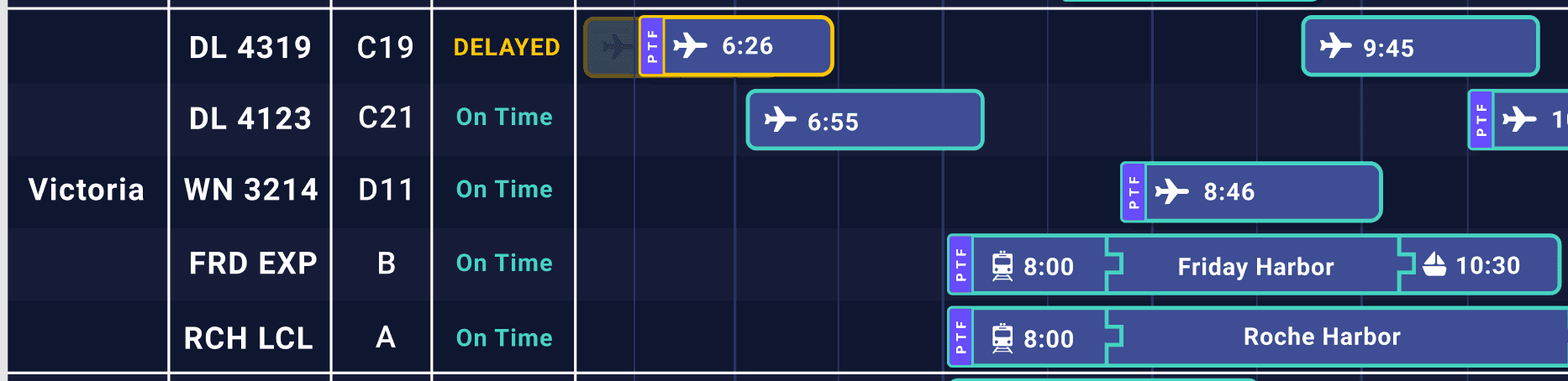
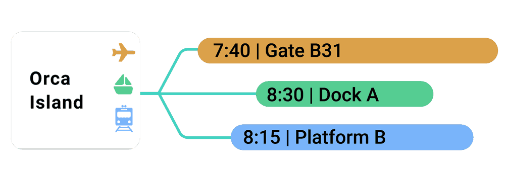
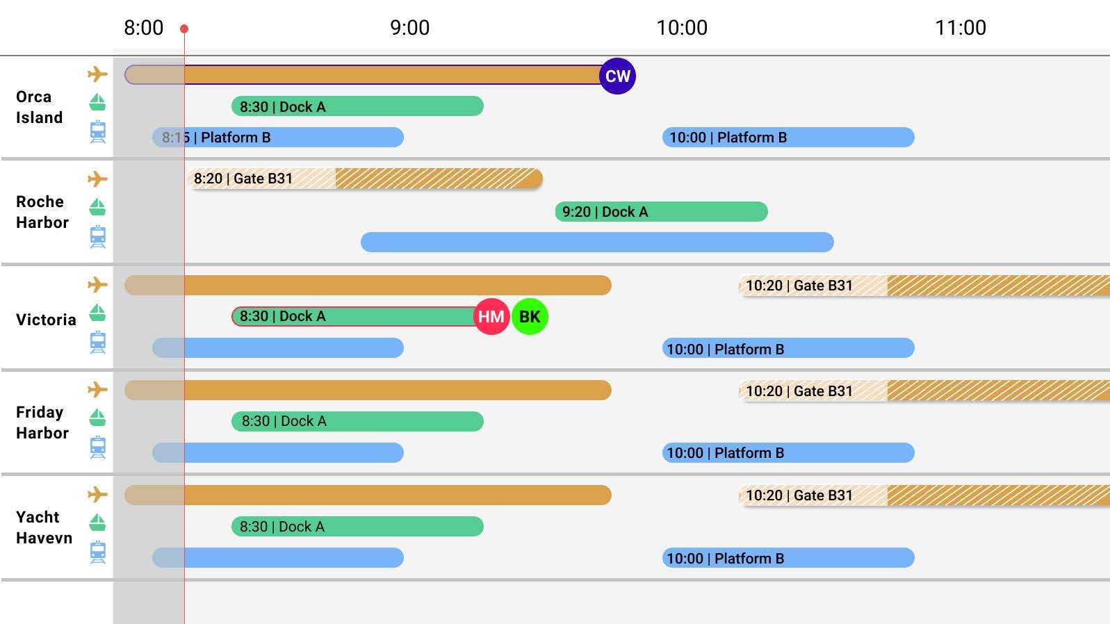
With a time-block based display, travellers easily compare arrival times and durations for different transportation methods with common destinations:
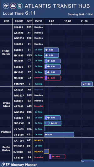
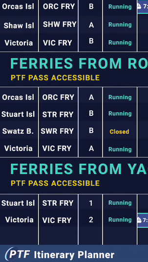
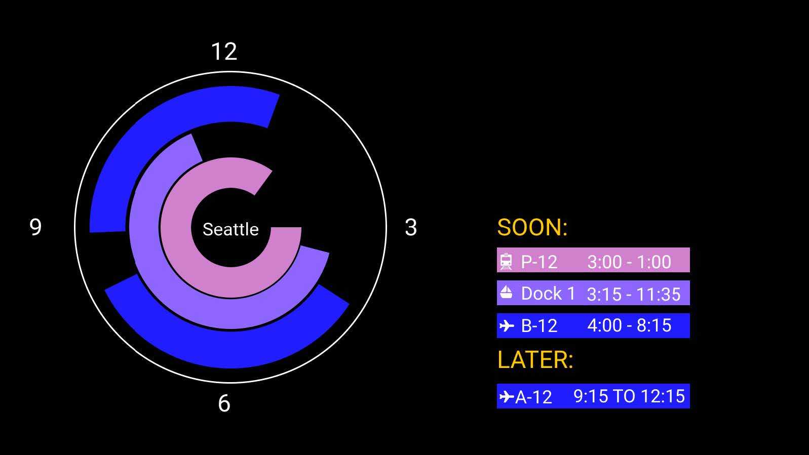
PTF Earliest
To our paying passholders, we offer PTF Earliest, a quick overview of the fastest means to get to any San Juan Islands destination, accessible only with the PTF Pass.
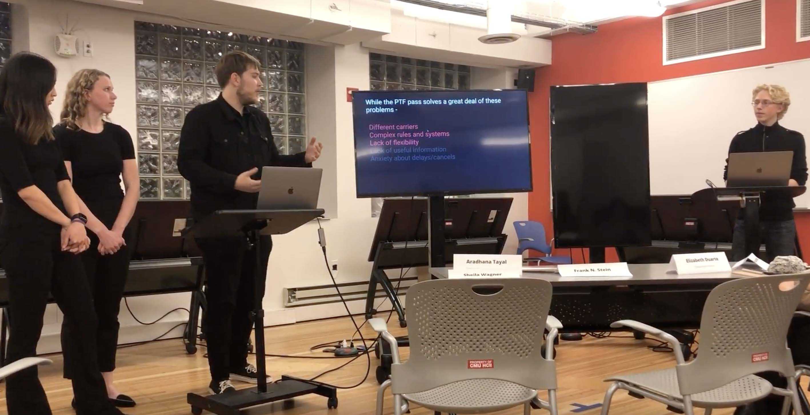
We give passholders the added value of flexibility to recover from canceled or delayed trips.
Our users needed a faster way to filter through our data. We conceived of a control that would let users quickly bring up potential journeys based on arrival time.
A printed map is mounted below each of our displays. It’s activated by electronics embedded in the PTF pass itself...
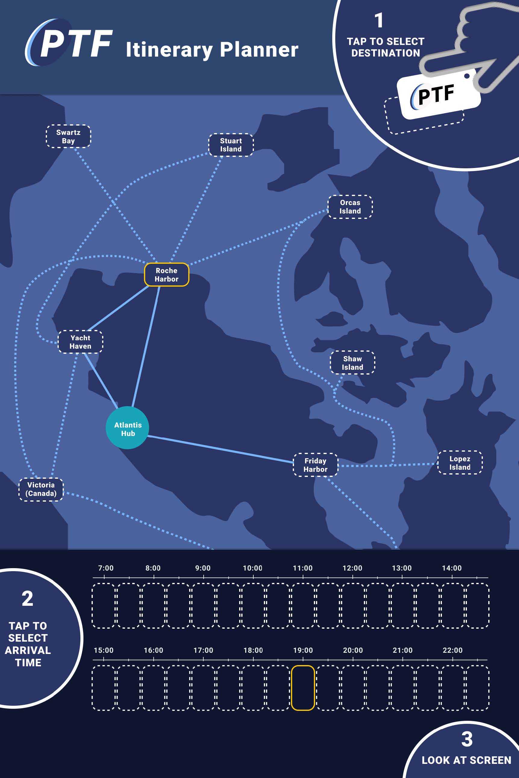
...When a user taps their pass to the map, a digital footer temporarily appears at the bottom of the main screen.
It's cut right from the PTF Earliest Page: the earliest possible flight, ferry, or train to their destination of choice.
We put the perks of the PTF Earliest Page into the pass itself.
In our design, the physical pass is the key to our interactive map. We aimed to strengthen the PTF brand by embodying the essential ways it benefits its passholders—fliexible travel, easy scheduling, and exclusive journeys—in the object of the pass itself.

UX PROCESS
User & Stakeholder Alignment: Easier and More Flexible Travel
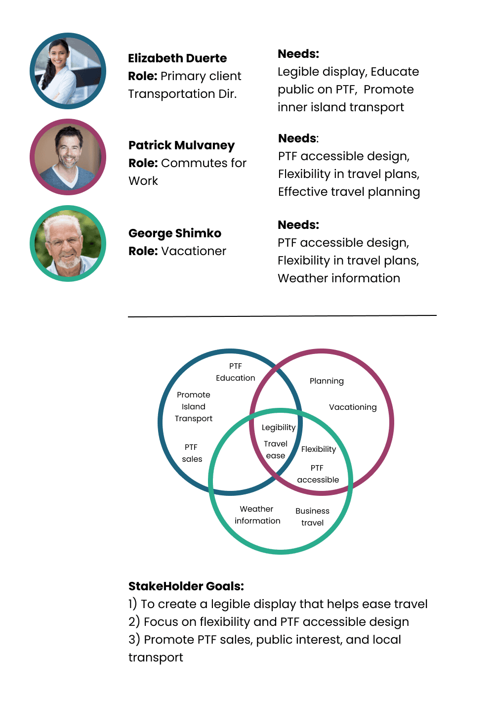
Beyond the Standard
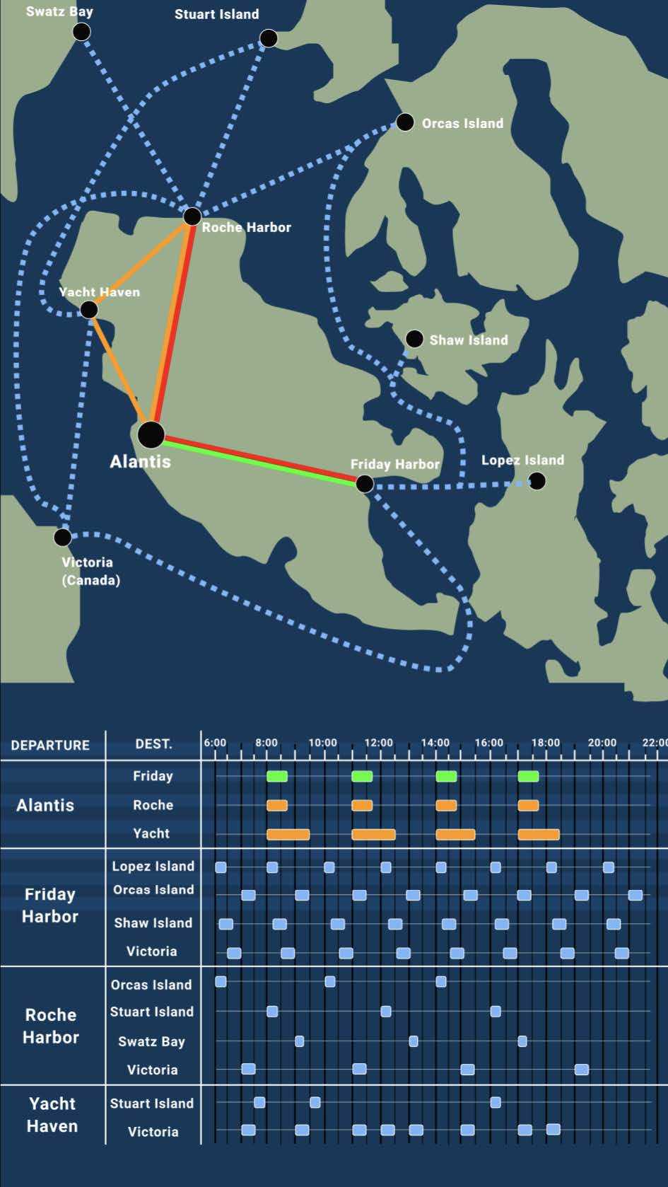
From our stakeholder needs, it seemed like having a good sense of connections and time-management were priorities, and could be addressed through a display similar to a calendar:
Web Calendar Model
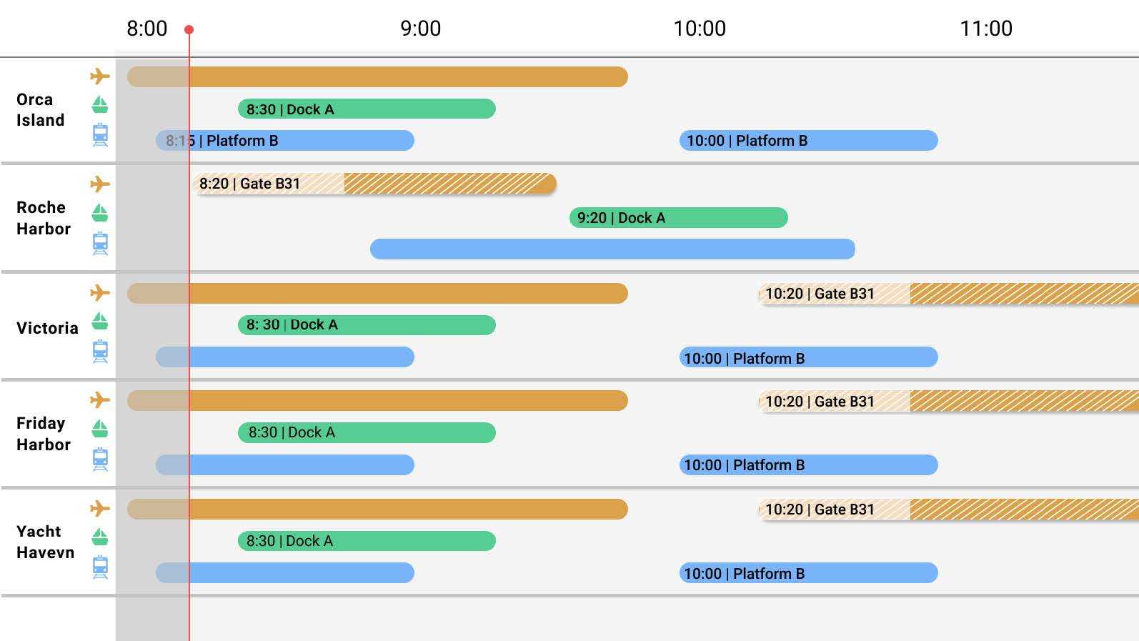
One clear advantage of representing trips in this way: The entire duration of travel is captured in the time blocks.
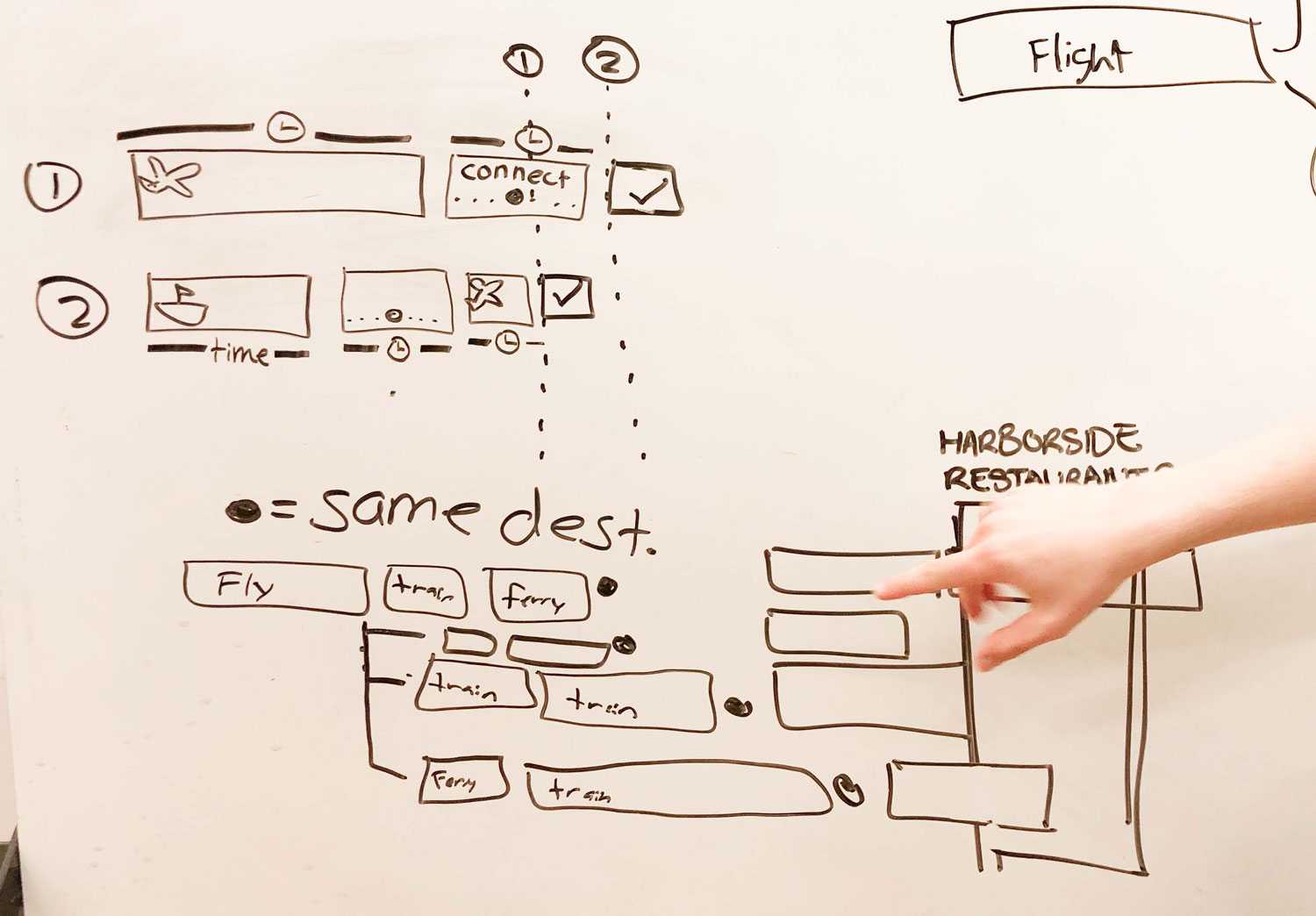
Diverging Designs: Three Explorations
We wanted to branch off from this first prototype by re-incorporating other stakeholder needs, individualizing displays and better highlighting trip connections and durations.
Augmented Reality
Circuit Board Display
Circle Travel
Feedback from these initial designs pushed to incoporate more user-needed data, like flight status.
We switched to portrait-orientation to account for additional data columns like flight status as well as overlapping flights.
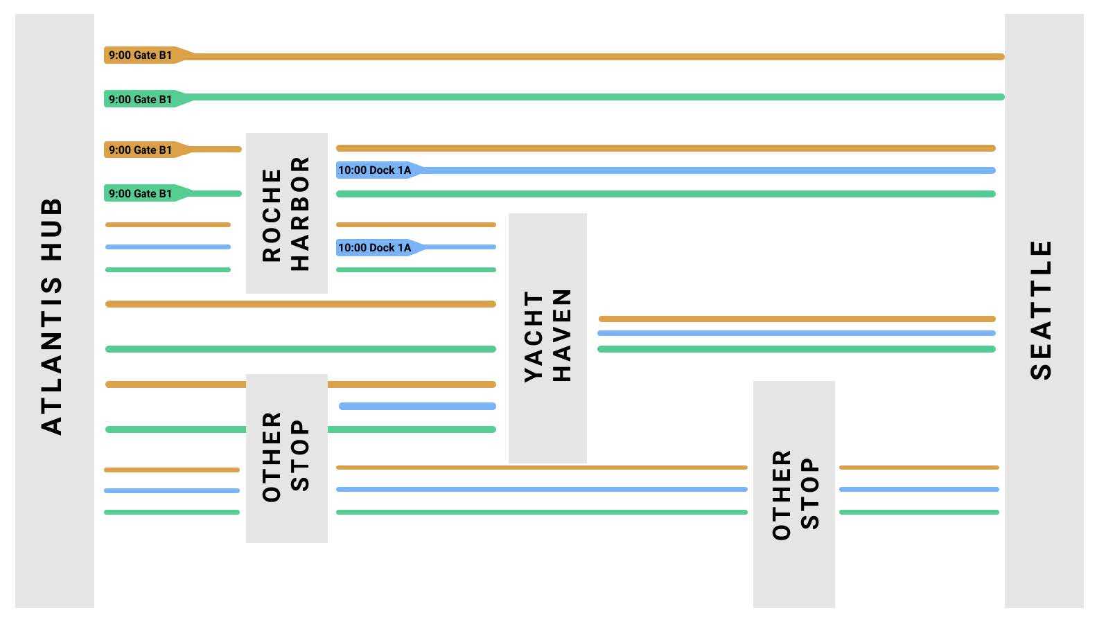
We developed a map as the clearest way to show connections between destinations.
UX SOLUTION
Using Motion to Expand Our Display
To comprehensively address all the data points we needed to show our users, we used motion to expand the size of our display beyond the space of our target screens.
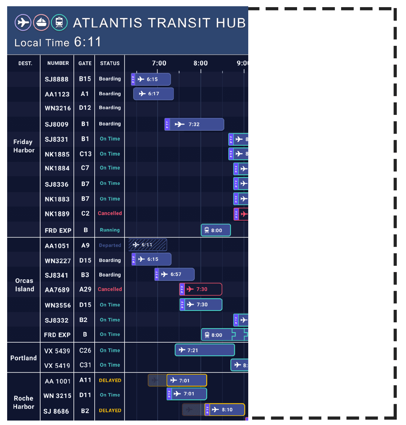
Users know to look for the journeys by destination and then by flight number or gate, but then how they interpret our “new” time blocks display? How do they know to wait to see time blocks extending off the edge of the screen?
We dropped the distinct pauses on different sections of our display in favor of a continuous motion, forgoing the need to otherwise feedforward that more data will soon be displayed.
Flexibility, Empowerment, and Luxury
These parts of the PTF experience we wanted to emphasize in our pitch. Using the theme of “visualizing and taking control of your time,” we discussed how our display supports flexible, empowered, and luxurious travel.
We developed our pitch around these insights:
- Contemporary displays don’t visualize time effectively.
- This makes it difficult to make complicated or emergency plans inducing stress.
- Visualizing time in the form of blocks can reduce stress by making emergency and complicated rescheduling easier.